Signature Wall with a Punch
One of my favorite ways to transform a room is with wall finishes. I like to find unique ways to create what I call a signature wall, making that wall the anchor to the design. To do this you need to create contrast through color, texture or shape.
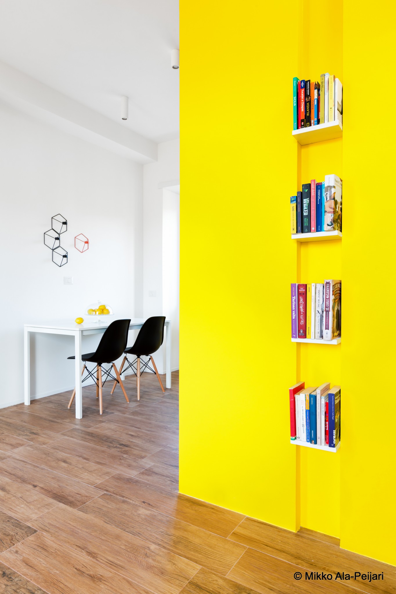
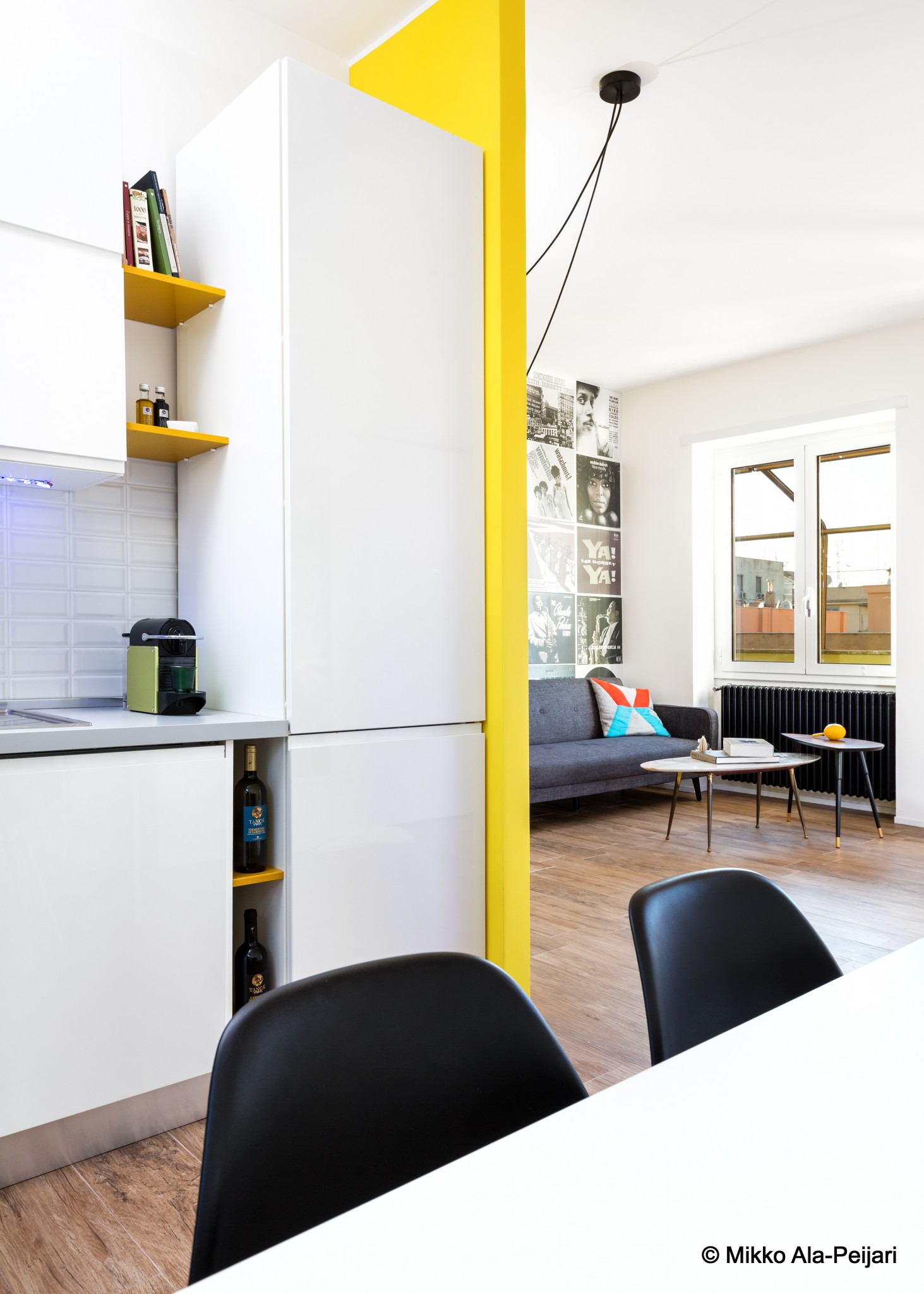
COLOR
Color impacts a design, but it’s not just changing the color of the wall, you need to take into consideration how the wall is viewed from adjacent spaces and how it will impact all areas.
TEXTURE
This was an industrial contemporary design I created using concrete for the counter top and counter top legs. The signature wall looks like concrete, but I actually used a porcelain tile due to concrete on the wall application being out of the budget. You can see how important the signature wall is to the integrity of the design, it holds the design together.
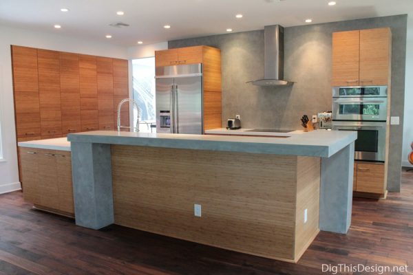
Design by Patricia Davis Brown Designs
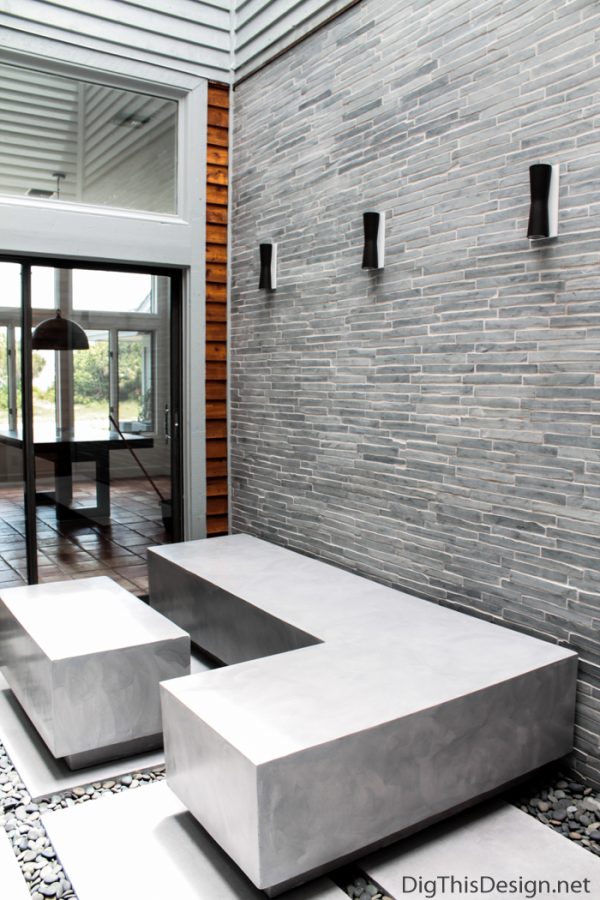
The cladded wall of the outdoor atrium gives a horizontal texture, with volcanic stone tiles creating a calming effect, fitting of a zen space.
SHAPE
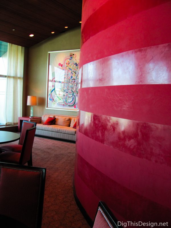
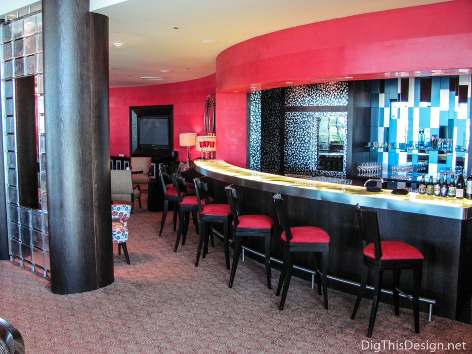
The shape of a wall can actually create a visual movement to the room. The bright red Venetian plaster, with the horizontal strip pattern, continues the movement of the wall throughout the space.
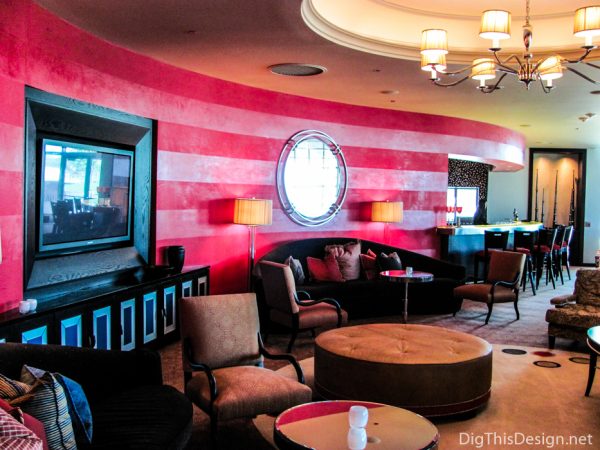
Venetian plaster also uses texture and the bright red color creates an undeniable focus too.
Other topics of design you might find interesting:
A Look at The Top Home Design Trends for 2016
Small Bathroom Solutions with a Big Impact
Tips on Picking The Right Window Treatment

