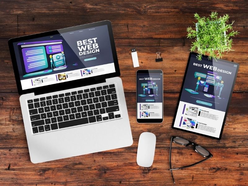
The main task of designs for entertaining websites is to bring out positive emotions to turn users into regular site visitors. Therefore, not only outstanding content is important, but also the terrific design, interface, and responsiveness. Even if a user likes the function of the website, they will still leave if the color scheme, fonts, or pictures are of bad quality or out-of-date. Are you a website owner or want to start one? Then, we invite you to continue reading for the most relevant trends in designs for entertaining websites for 2021!
Designs for Entertaining Websites in 2021 and the Trends You Must Know

Trend 1: JSON and SVG Animation
There are many good illustrations in 2021. To make them even more interesting, designers animate them. It works not only for pictures but also for icons. You can make them better by adding animation in the interface, especially where they are appropriate. Examples of such experiments you can find on the best NetEnt sites to play on the internet.
Trend 2: Ideal Icons
In 2021, making odd icons is simply unacceptable. Web interfaces in 2021 should be ideal. We recommend focusing your attention free icons. They should be made in the same style, parameters and line width. Icons from different families in the interface compromise the integrity and accuracy of the project. We also recommend using newer icon libraries: they tend to have a more modern look.
2020 became just a boom for the development of design libraries. Over the past year, a huge number of ready-made, professional and high-quality icons appeared for every taste. Today, there is simply no point in drawing icons with your own hands and wasting time on them. Thousands of designers from all over the world have created the best icons for any project and task.
Trend 3: 3D Icons and Illustrations
We associate the emergence of a trend on 3D icons and illustrations with the fact that knowledge in this field has become more accessible. Many courses and lessons on this topic have appeared. The designers took advantage of all this and began to develop this theme by creating libraries of 3D objects.
Trend 4: Minimalism and Simplicity
There have been a lot of experiments in the history of interfaces, and today designers have concluded that a good interface is one that is not visible. Therefore, white color and a minimal design style is the best option for these tasks. We recommend you focus on details: fonts, icons, colors, UX, animation. For your convenience, below is a list of helpful items.
1. Keep only the most important user functions in the front.
2. Let the interface be light and airy. Don’t use massive colors. The main focus should be on the content.
3. Involve good fonts and layout, right accents, icons, and consistency to your design.
4. Focus on details in your design.
5. Make the interface “invisible”, but intuitive and user-friendly.
6. Do not deviate too much from familiar functions and design for users.
Many respectful platforms with a large audience incorporate design because the trend for minimalism and simplicity will remain relevant for a long time.
Trend 5: Shadows and Gradients
This is a trend from the past that is becoming more prevalent today. However, there are changes to the emergence of airiness, lightness, and volume. All this is mixed with pastel gradients and new trending 3D icons. This is the same minimalism, only more voluminous.
In conclusion.
What 2021 entertaining web design trends do you like the most? If you have any questions or suggestions, we always love to hear from you in the comments below. Also below are links that will take you to more fantastic articles about ALL things DESIGN for your home or business.
Images Courtesy of Canva.
Other Posts You Might Enjoy:
10 Online Creative Resources to Learn Graphic Design
3 Design Tips for Your Holiday Home
These Guaranteed SEO Services will Give Your Website the Edge in 2021


